01
Potential or practical choice?
Compare the germination story with clear crop-range information as the opening message.
A season begins with a considered choice.
A seed-brand concept that makes the choice before planting visible through growth, packaging and work in the field.
INDEPENDENT CONCEPTThese are demonstration concepts for fictional brands, not campaigns created for clients. They explore simple creative ideas, messages and promotional formats adapted to different industries and platforms. The visuals were generated with AI under the creative direction of the NOT MORE. team.
“Potential starts here.” begins at the scale of a germinating seed. The three crop packages make the range concrete, while the agronomist brings the decision back to a field and a season. The story is about the importance of the choice, not a promised yield.
Burgundy, sand and botanical green meet harvest yellow in textured photography and kraft packaging. Concentric seed lines and botanical drawings connect the identity with the product. The artwork’s editorial headlines give each composition an unhurried focus.
The main visual captures germination; product and human routes show the choice from different distances. Feed, vertical and outdoor executions simplify those ideas. Seed sacks, printed material, a service pickup and an exhibition stand explore physical brand applications.
The website mockups introduce wheat, corn and sunflower before an illustrated crop inquiry. A real selection process would need verified variety information, regional suitability, availability and agronomic advice. The packaging and field imagery do not establish seed performance.
These explorations show how tone, message and composition can change. A creative direction proposes a point of view; an adaptation takes it into another placement. Compare the options and notice what stays recognizable from one material to another.
“Potential starts here.” uses germination to make the beginning of a season visible at the scale of a seed.
5 visuals in this direction
View the applicationsDistinct compositions and placement variants are collected here. Identical copies and equivalent exports are grouped as one visual.
Guide: what does each format do?34 / 34 visuals
Boards & explorations 001
Direction moodboard
Shared applications and boards
1536 × 1024 px
Key visuals 002
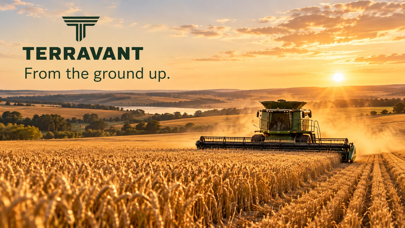
Key visual: campaign context
The beginning of growth
1672 × 941 px
Key visuals 003
Key visual: product in focus
A choice between crops
1672 × 941 px
Key visuals 004
Key visual: people and experience
The field comes first
1672 × 940 px
Digital ads / PPC 005
Feed ad: context
The beginning of growth
1122 × 1402 px
Digital ads / PPC 006
Feed ad: product
A choice between crops
1122 × 1402 px
Digital ads / PPC 007
Feed ad: experience
The field comes first
1122 × 1402 px
Social media 008
Stories: campaign context
The beginning of growth
941 × 1672 px
Social media 009
Stories: product in focus
A choice between crops
941 × 1672 px
Social media 010
Stories: an invitation to continue
The field comes first
941 × 1672 px
Brand & mockups 011
Presentation materials, mockup
Shared applications and boards
1536 × 1024 px
Brand & mockups 012
Brand kit, mockup
Shared applications and boards
1536 × 1024 px
PLEASE NOTEVertical visuals for Reels, TikTok and Shorts are static covers. Websites are mockups. Boards and mockups may contain illustrative examples; they are not measured results, manufactured products or print-ready files.
Compare the germination story with clear crop-range information as the opening message.
Check whether people can find the relevant crop and identify what they need to know before choosing.
Assess inquiries by crop, region and timing, then track whether they lead to a useful agronomic conversation.
HYPOTHESESThese are evaluation hypotheses for a real implementation. The concept has no measured commercial results.
We start with your audience, offer and resources. Then we define the direction and the materials your business needs.
Start a conversation